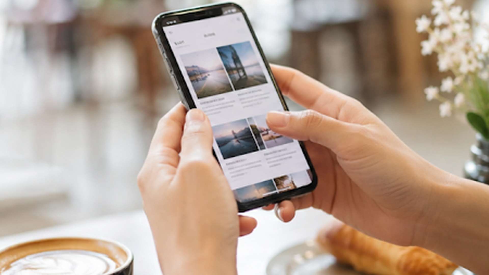
The way people interact with businesses has changed dramatically over the past decade. Smartphones have become an essential part of everyday life, allowing consumers to browse websites, shop online, research products and engage with brands wherever they are.
Whether someone is travelling to work, enjoying a coffee break or relaxing at home, they expect every digital interaction to be quick, simple and effortless. If a website is difficult to navigate or takes too long to load on a mobile device, potential customers are unlikely to stay.
A mobile-friendly digital presence is no longer a luxury—it is an expectation. Businesses that invest in creating seamless mobile experiences are better positioned to engage their audience, strengthen customer relationships and achieve sustainable growth.
At Unique Point, we help businesses develop mobile-first digital marketing strategies that make every online interaction smooth, accessible and effective.
Mobile Devices Have Changed Consumer Behaviour
Today’s customers rely heavily on their smartphones for everyday decisions. From comparing products and reading reviews to booking appointments and making purchases, mobile devices are often the first point of contact between a business and its audience.
People expect to find information instantly. They want websites that load quickly, menus that are easy to use and pages that display perfectly regardless of screen size.
When these expectations are met, customers are more likely to remain engaged and continue exploring your business.
Why Mobile-Friendly Marketing Matters
Your digital marketing efforts should provide a consistent experience across every device.
A mobile-friendly approach helps businesses:
- Improve user experience
- Increase customer engagement
- Reduce website bounce rates
- Encourage longer browsing sessions
- Generate more enquiries and sales
- Build trust with potential customers
- Strengthen brand reputation
Every positive interaction helps move visitors closer to becoming loyal customers.
Responsive Website Design Creates Better Experiences
A responsive website automatically adjusts its layout to suit desktops, tablets and smartphones.
Instead of forcing users to zoom, scroll sideways or struggle with tiny navigation menus, responsive design ensures content remains clear and accessible on every screen.
Important features of responsive websites include:
- Easy-to-read text
- Mobile-friendly navigation
- Optimised images
- Clickable buttons
- Fast page loading
- Simple contact forms
A responsive website allows customers to focus on your products and services rather than trying to figure out how to use your site.
Website Speed Makes a Lasting Impression
Speed is one of the most important elements of a positive mobile experience.
Even a few extra seconds of loading time can cause visitors to leave before they have viewed your content.
Slow websites can negatively affect:
- Customer satisfaction
- Search engine visibility
- Conversion rates
- Online enquiries
- Sales performance
Improving website speed through image optimisation, efficient coding and reliable hosting creates a smoother experience for every visitor.
Social Media Should Be Designed for Mobile Users
Most social media activity happens on smartphones.
This means every post, image, video and advertisement should be created with mobile users in mind.
Effective mobile-friendly social content includes:
- Clear visuals
- Concise messaging
- Vertical or square video formats
- Readable text overlays
- Strong calls to action
Content that is easy to consume on smaller screens is more likely to encourage interaction and sharing.
Mobile-Friendly Content Improves Engagement
People often browse on mobile devices while multitasking.
Because of this, your content should be easy to scan and understand quickly.
Simple ways to improve readability include:
- Short paragraphs
- Clear headings
- Bullet points
- Relevant images
- Straightforward language
- Well-spaced layouts
These improvements help readers find the information they need without feeling overwhelmed.
Search Engines Reward Mobile-Friendly Websites
Search engines increasingly prioritise websites that perform well on mobile devices.
A website that offers an excellent mobile experience is more likely to achieve stronger visibility in search results.
Mobile optimisation supports search engine optimisation by improving factors such as:
- User experience
- Page speed
- Accessibility
- Navigation
- Engagement
- Time spent on site
Combined with quality content and strategic keyword placement, mobile optimisation becomes an important part of a successful SEO strategy.
Every Digital Touchpoint Should Feel Consistent
Customers rarely interact with a business through a single channel.
A typical customer journey may involve:
- Discovering your business through social media
- Visiting your website
- Reading customer reviews
- Downloading information
- Contacting your team
- Completing a purchase
Every stage should provide a consistent experience.
Consistent branding, messaging and functionality help customers feel confident in your business regardless of which platform they use.
Common Mobile Experience Mistakes
Many businesses unintentionally create barriers for mobile users.
Some of the most common issues include:
- Slow-loading pages
- Difficult navigation
- Small fonts
- Buttons that are hard to tap
- Large pop-ups covering content
- Unresponsive layouts
- Poor-quality images
Addressing these problems can significantly improve customer satisfaction and increase conversion opportunities.
Mobile Marketing Extends Beyond Websites
A mobile-first strategy should influence every aspect of your digital marketing.
Consider how your audience interacts with:
- Email campaigns
- Landing pages
- Online forms
- Digital advertisements
- Blogs
- Video content
- Social media profiles
Every interaction should feel effortless, regardless of the device being used.
The easier you make it for customers to engage with your business, the more likely they are to continue their journey.
Planning for the Future
Mobile technology continues to evolve, and customer expectations will only increase.
Businesses that regularly review and improve their digital experiences are better prepared to adapt to changing trends and technologies.
Investing in mobile optimisation today helps ensure your website and marketing remain competitive tomorrow.
Rather than making occasional updates, successful businesses treat mobile usability as an ongoing priority.
Deliver Better Digital Experiences with Unique Point
Creating a seamless mobile experience is about far more than making a website look good on a smartphone. It involves understanding how people interact with your brand across multiple digital channels and removing every possible barrier between interest and action.
At Unique Point, we develop digital marketing strategies that place your customers at the centre of every decision. From responsive website design and search engine optimisation to engaging content and social media marketing, we help businesses create mobile-friendly experiences that encourage stronger engagement and long-term growth.
When every digital touchpoint works effortlessly on any device, your audience is more likely to stay, interact and become loyal customers.

Reach Out To Us
Contact us through your preferred method. We are eager to connect with you and explore how our Digital Marketing Team can contribute to your success.
Phone